

Not On The Highstreet
CHALLENGE
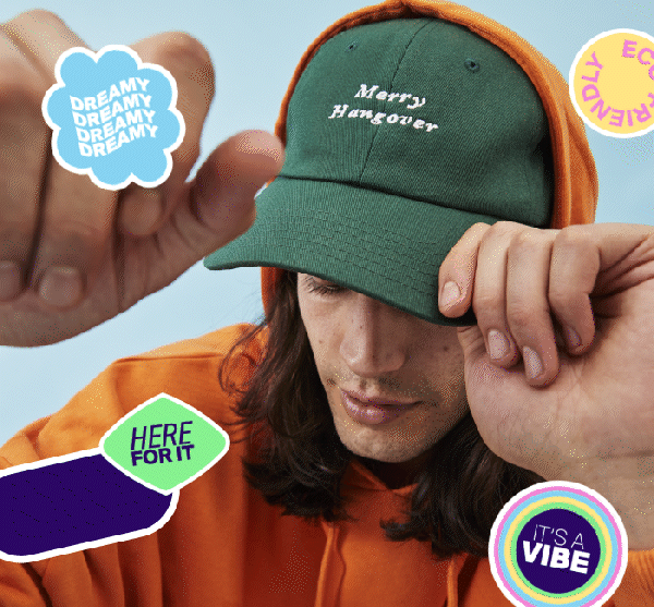
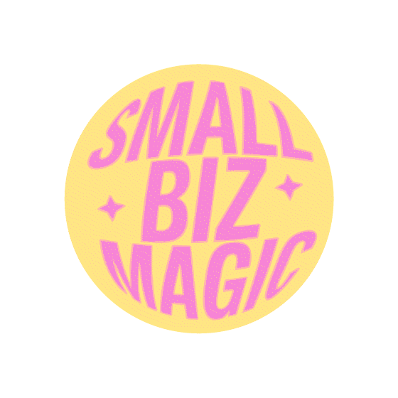
NOTHs had just had a rebrand for their ATL, but their digital presence was lacking love and assets. With a new logo, positioning, and font suite they needed something for their marketing to make everything pop. Taking their logo, I developed a collection of shapes, built from their new ‘knot’ logo to be used across all media, along with a bright and fun colour palette that is perfect for digital. I also created a bank of social templates, along with gifs to be used on instagram!


“Honestly could not have dreamed of so much amazing stuff! You’ve done such an amazing job.
I thought Thea’s eyes were going to pop out!”
— NOTHs Creative Director